Keops Physical Therapy
Keops Physical Therapy
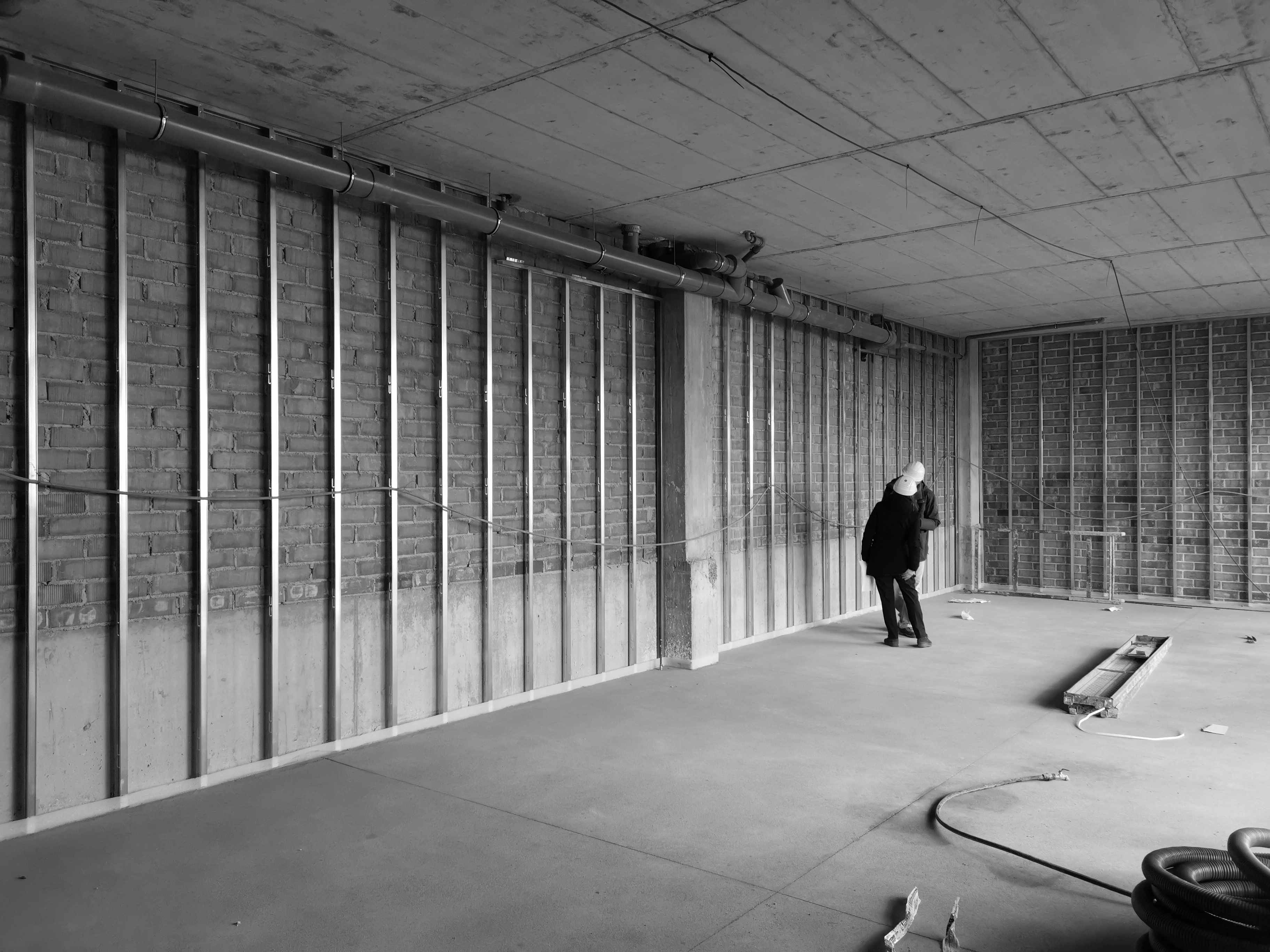
Although a centre like this requires certain separations, this project sought to create a single space with a breadth and width visible from one end of the workplace to the other. We wanted to give that space the largest possible dimensions. A bright, open atmosphere is present in each of the centre’s individual spaces, tying them together and allowing them to interact.
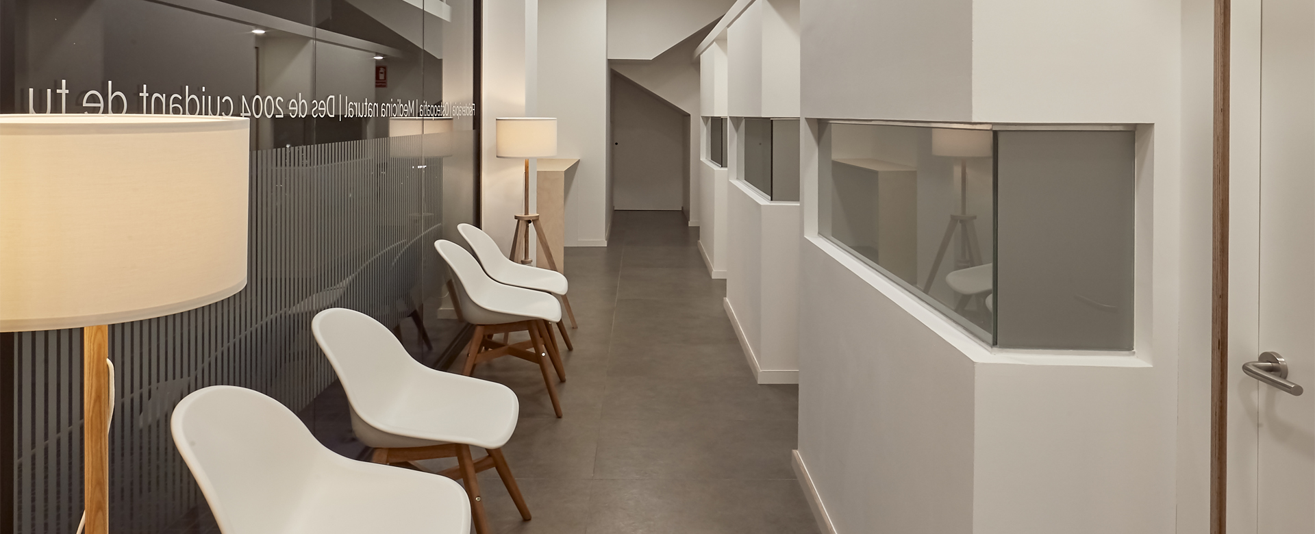
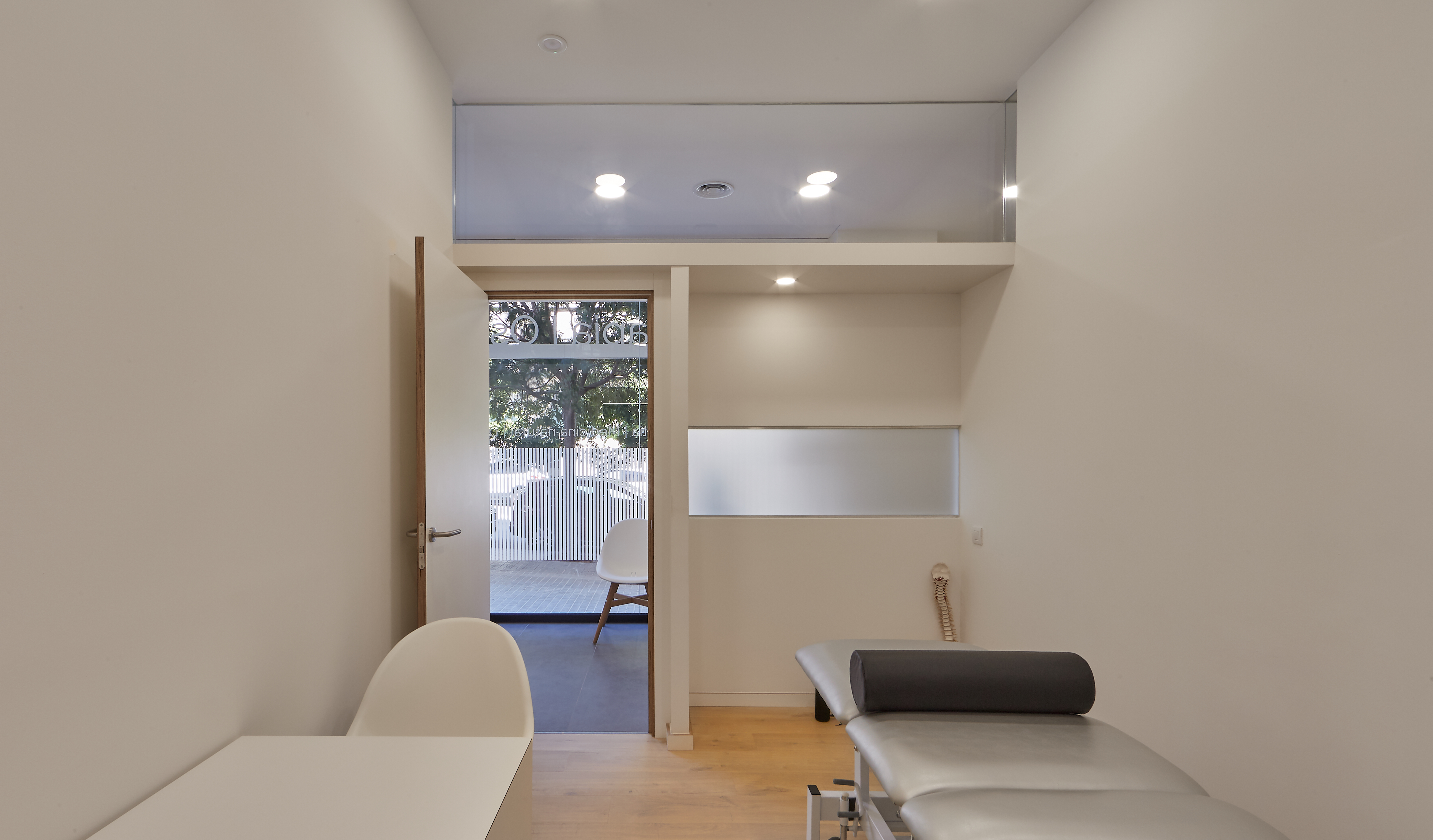
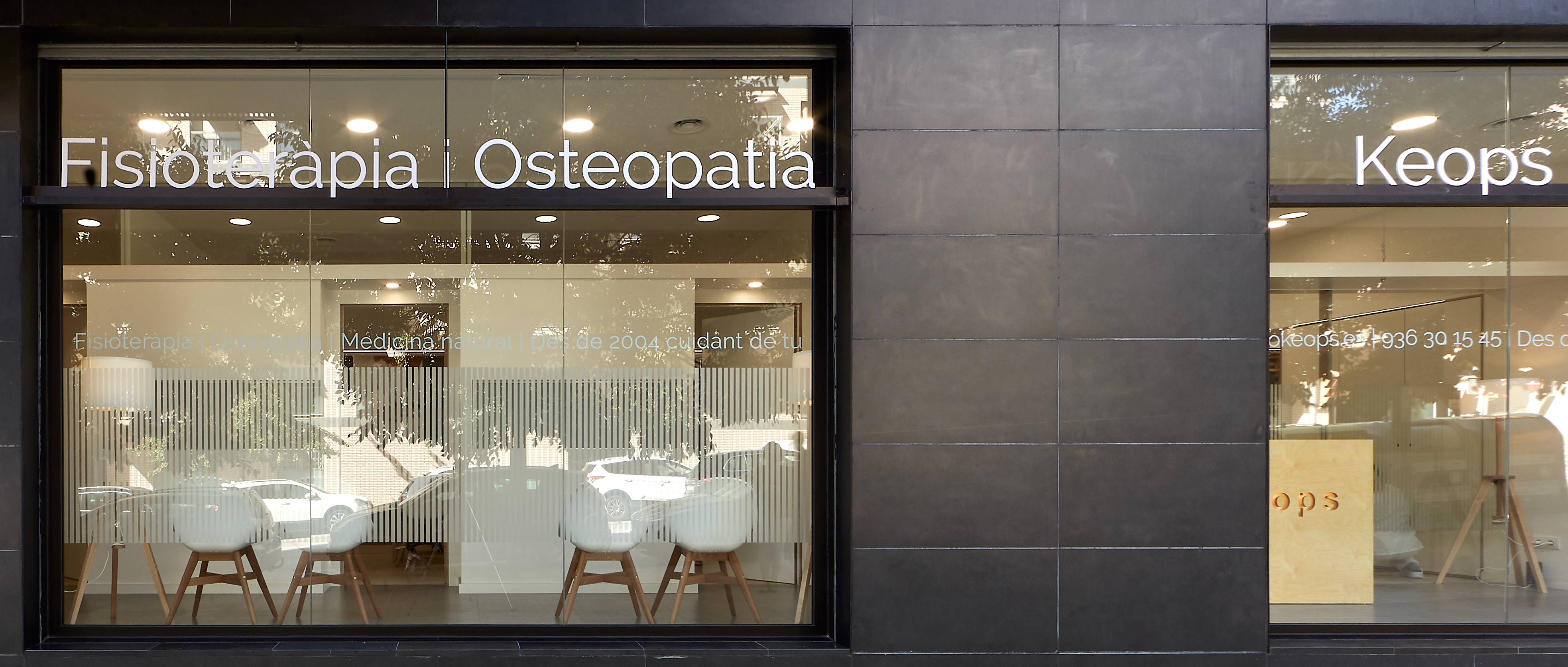
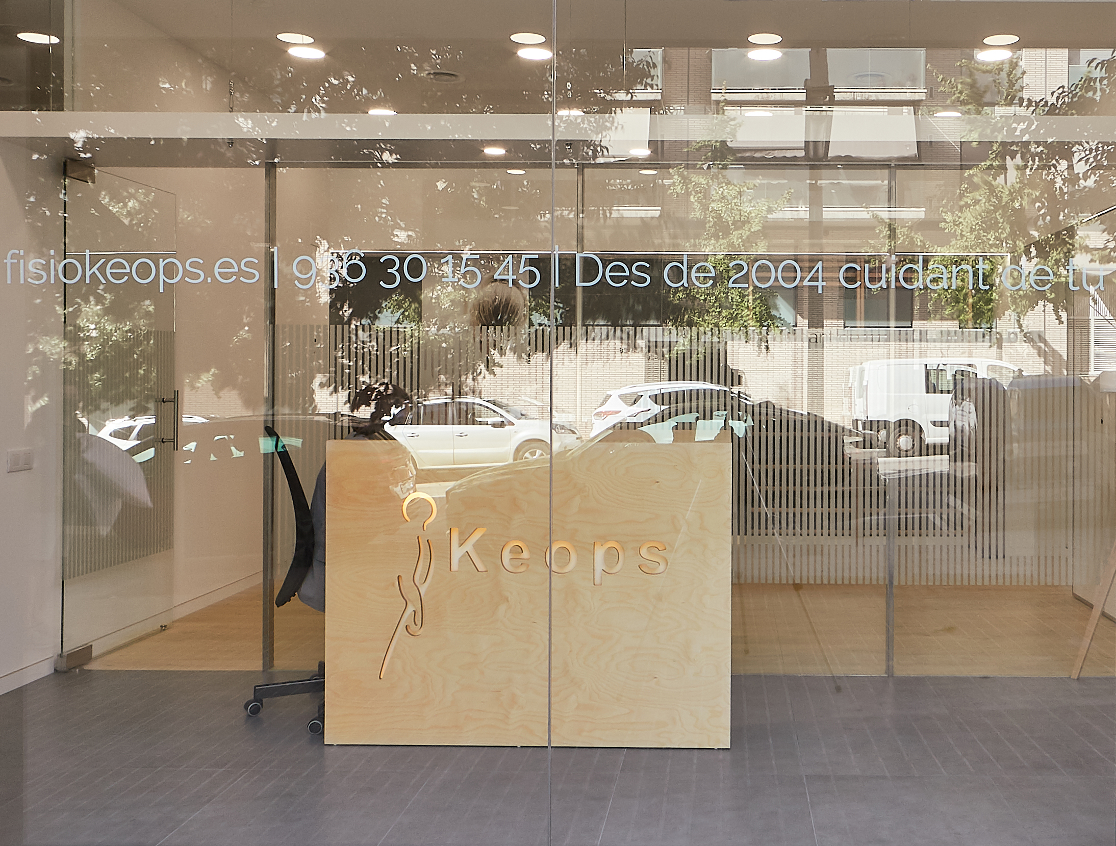
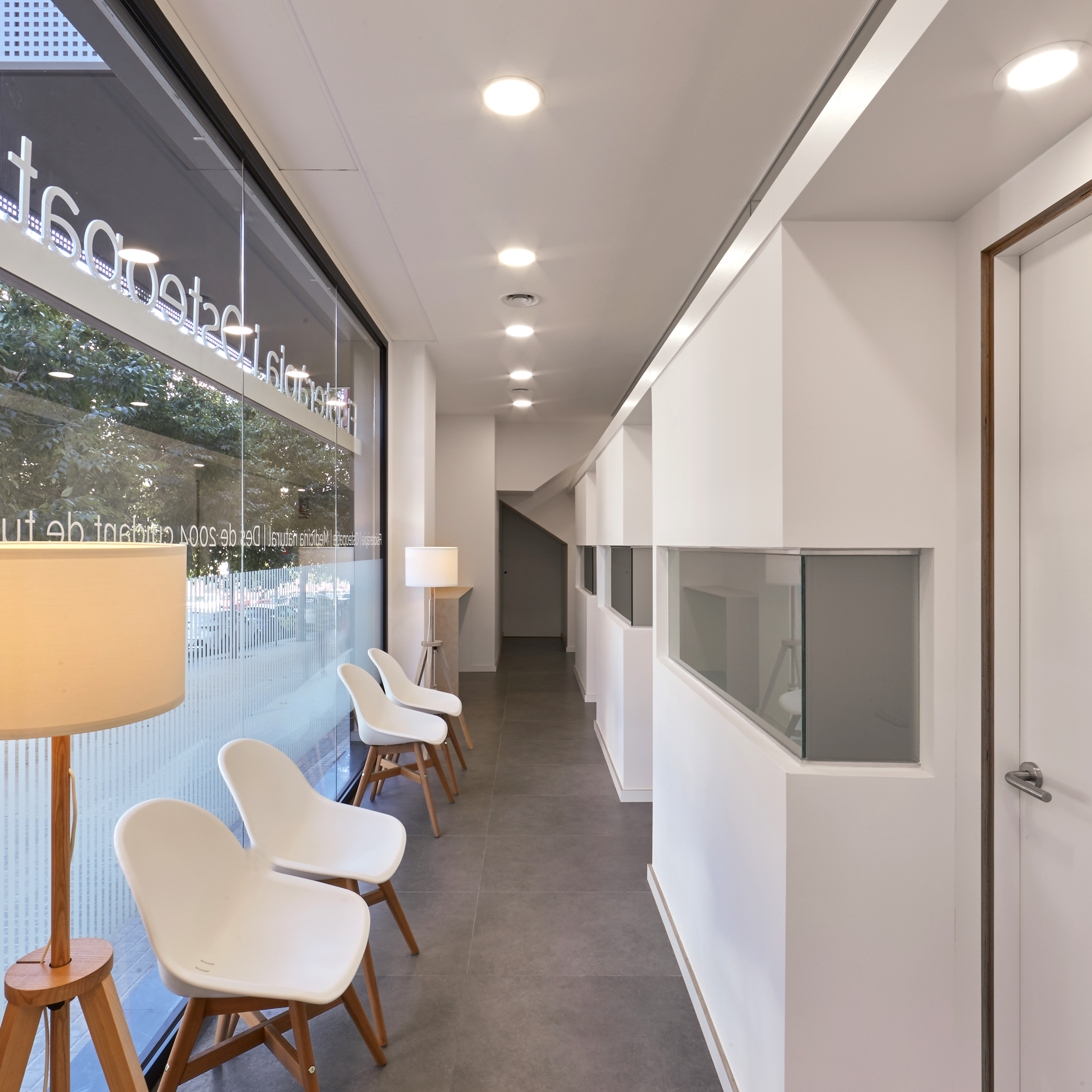
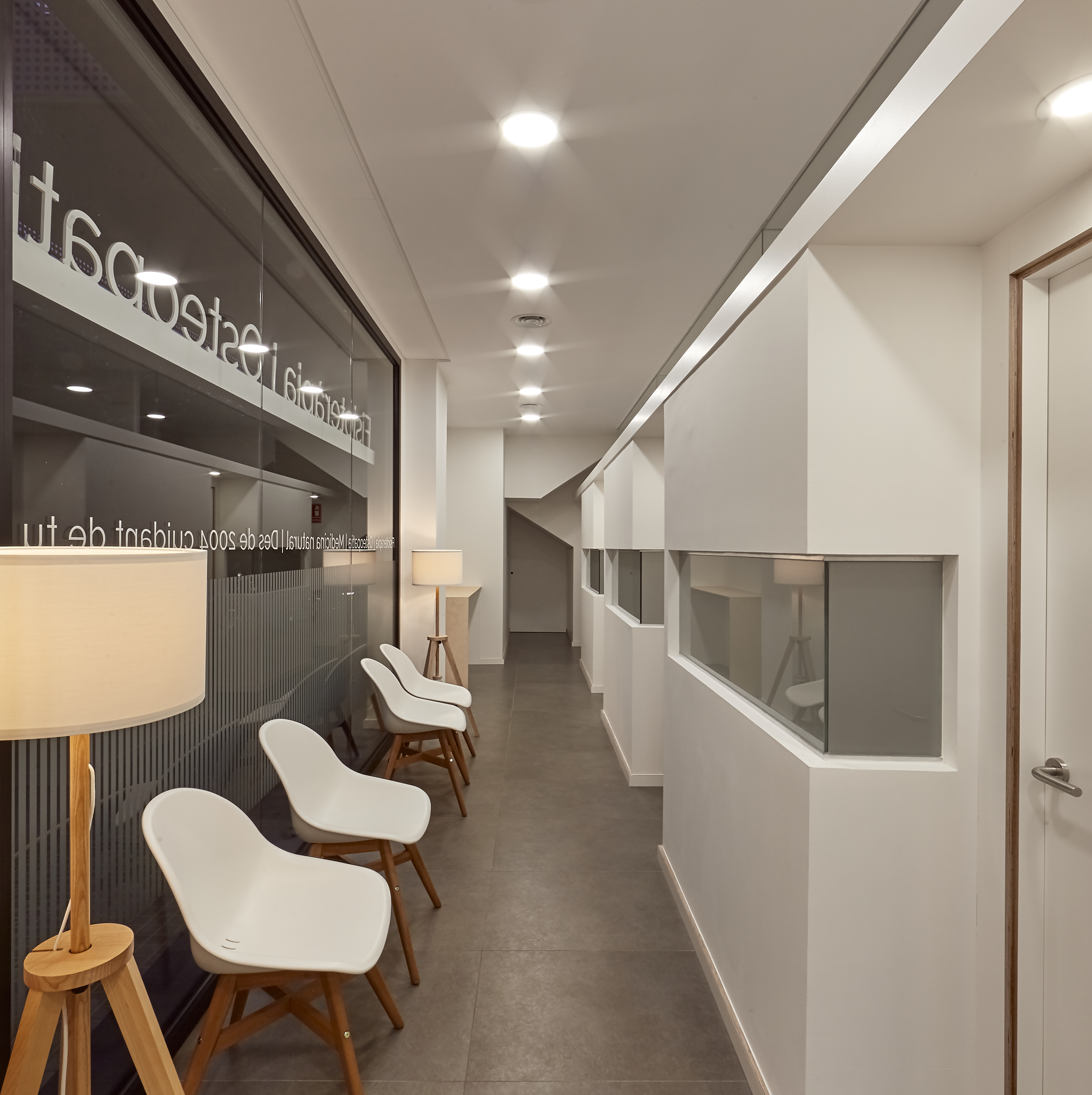
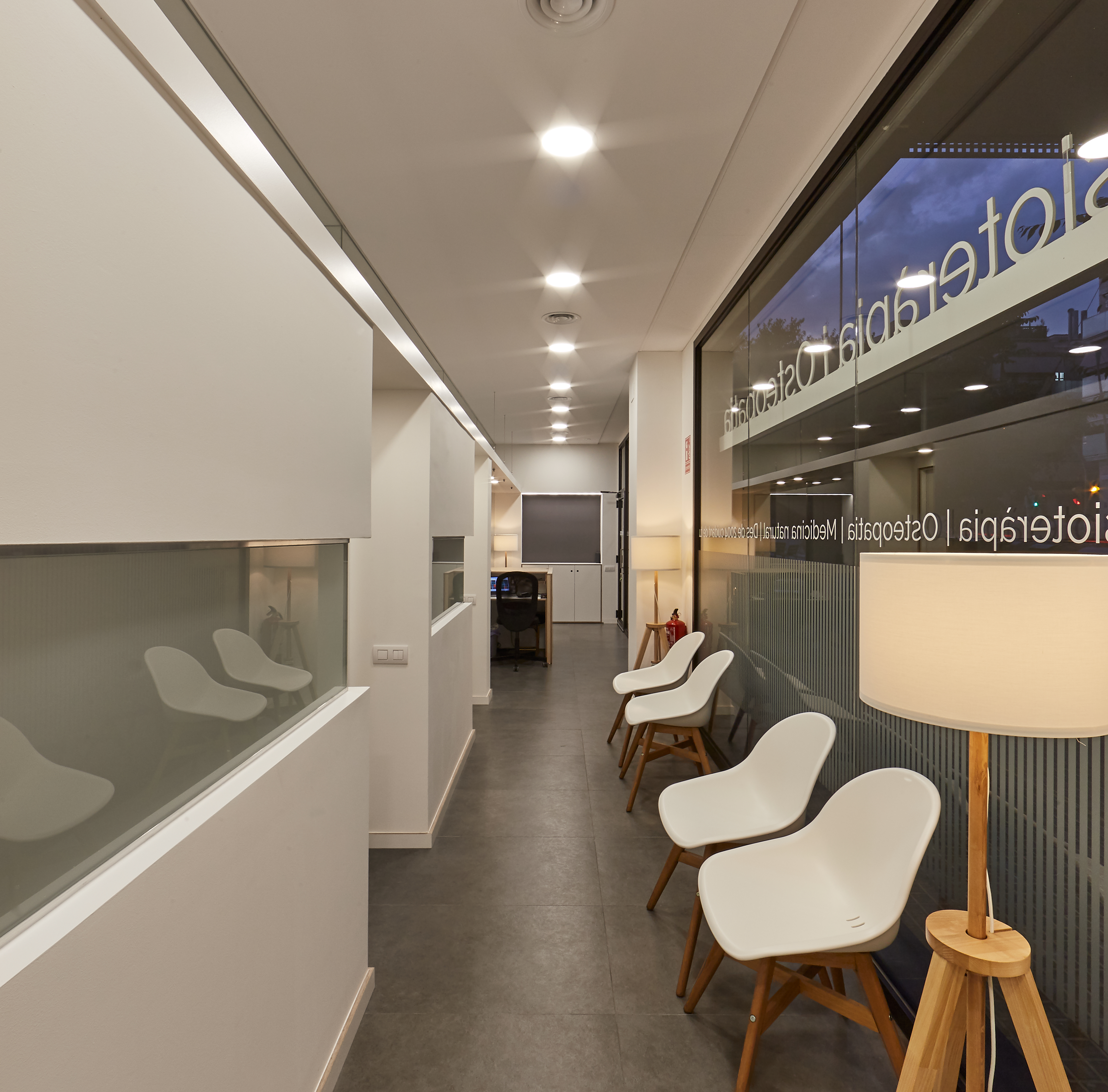
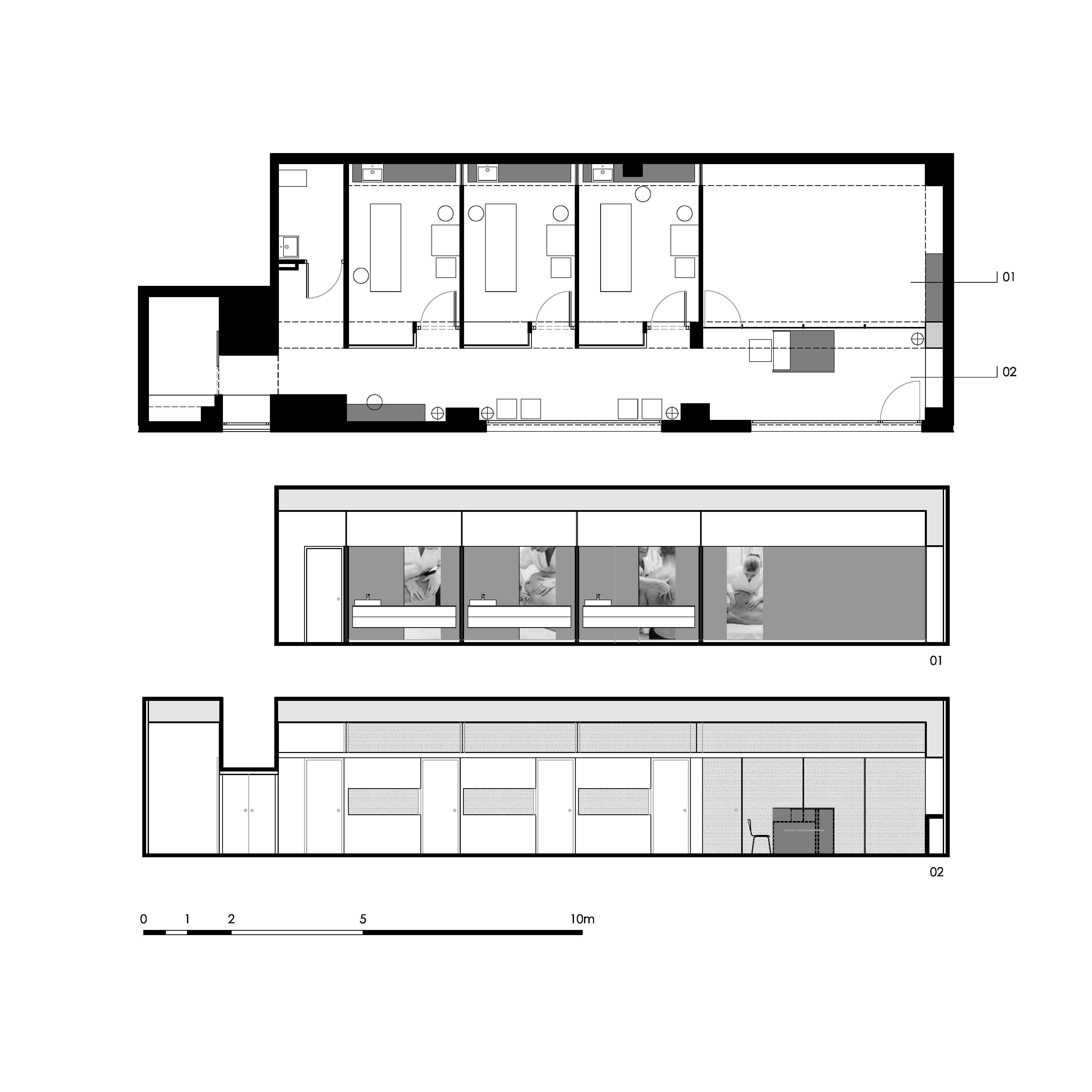
The entrance sits at one end, where the elevation of the floor and the street come together. The floorplan is a rectangle with the long end parallel to the façade. Two broad storefront windows open onto the street.
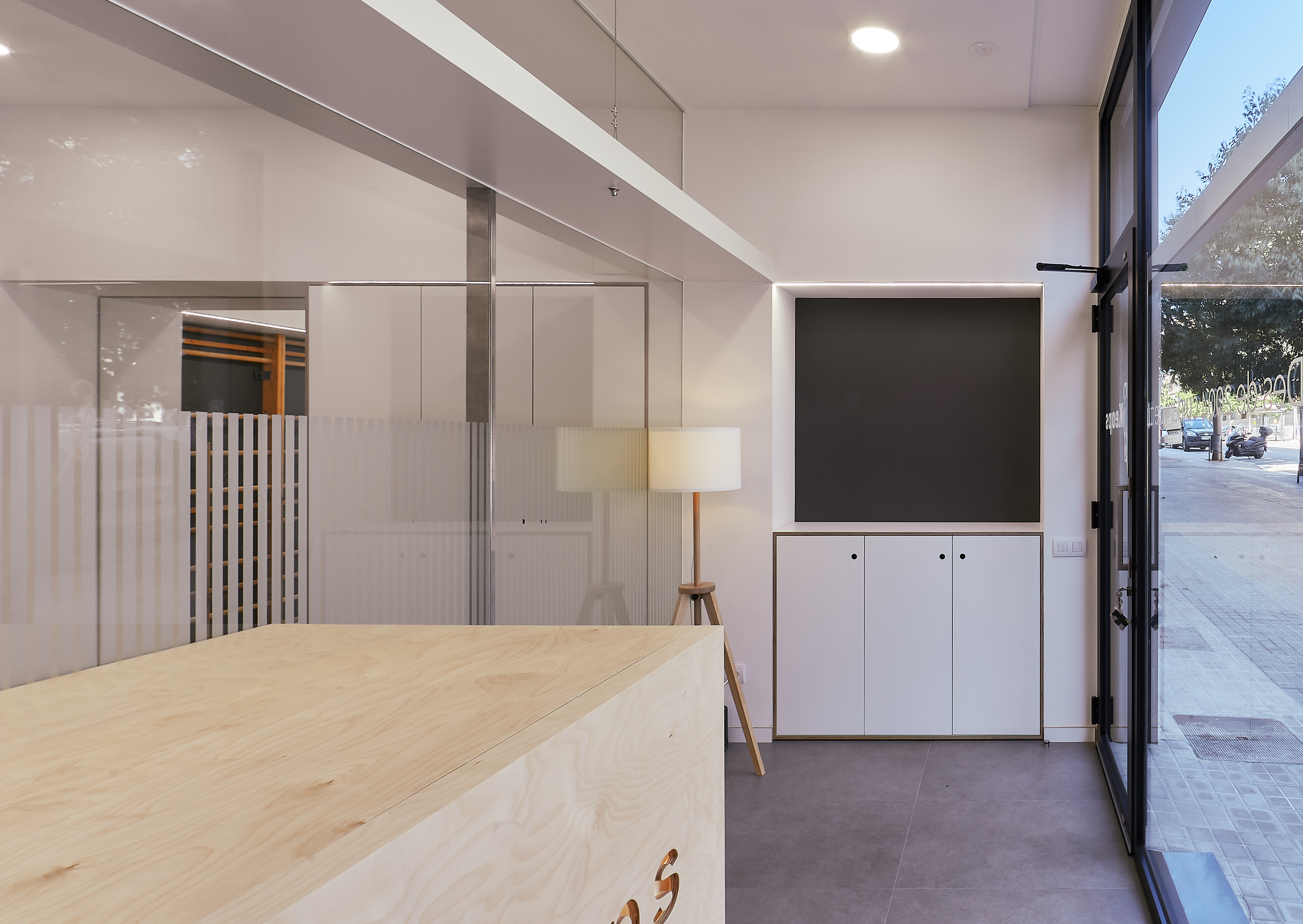
This project consists of a series of elongated strips that sit parallel to the façade. The first serves as an entrance and a reception area, and then provides access to the remaining spaces: a gymnasium, three booths, a restroom and a storage space. It’s also wide enough to serve as a waiting room. The size and simplicity of the two large windows transform the street into an additional band that shares its dimensions and natural light with the interior.
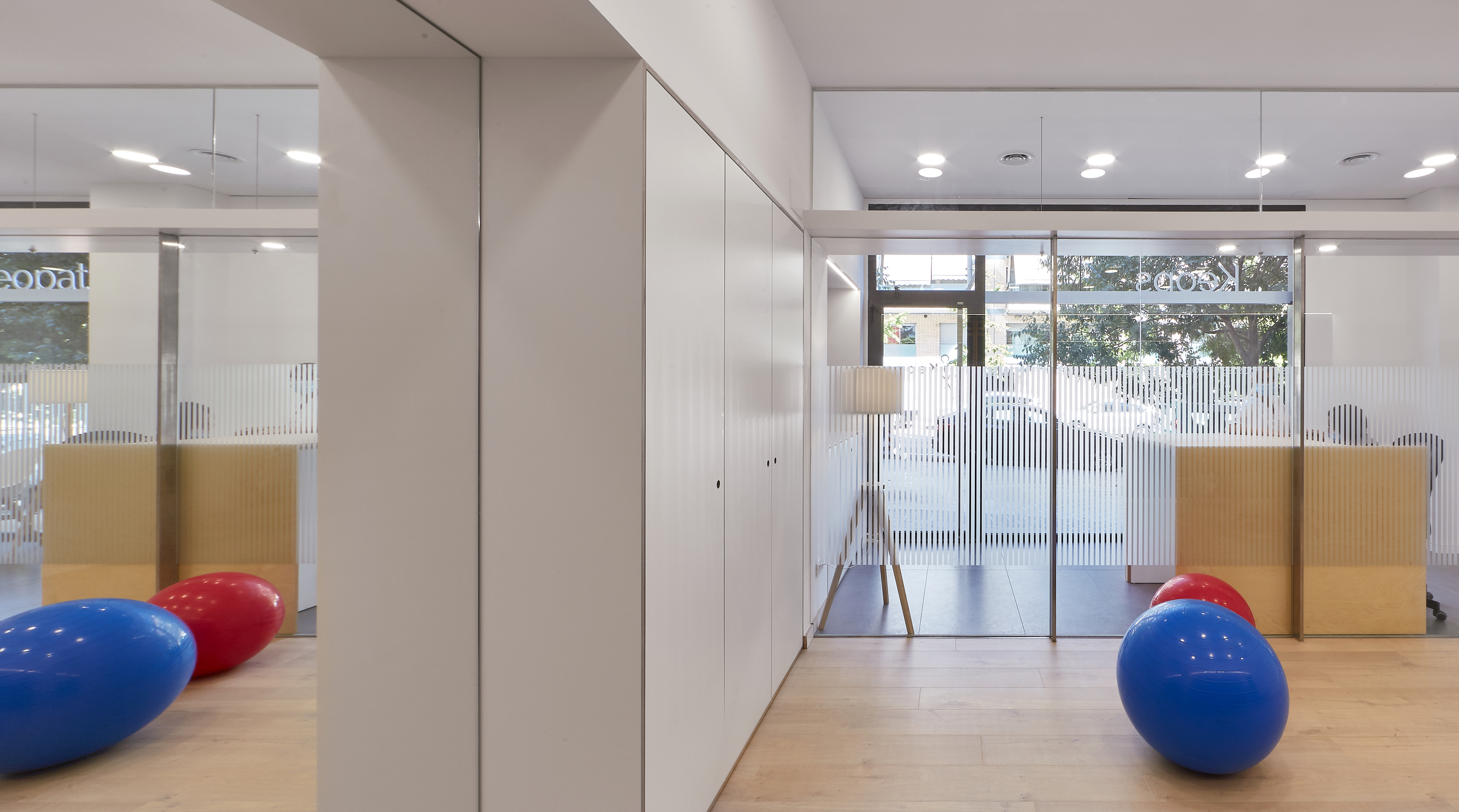
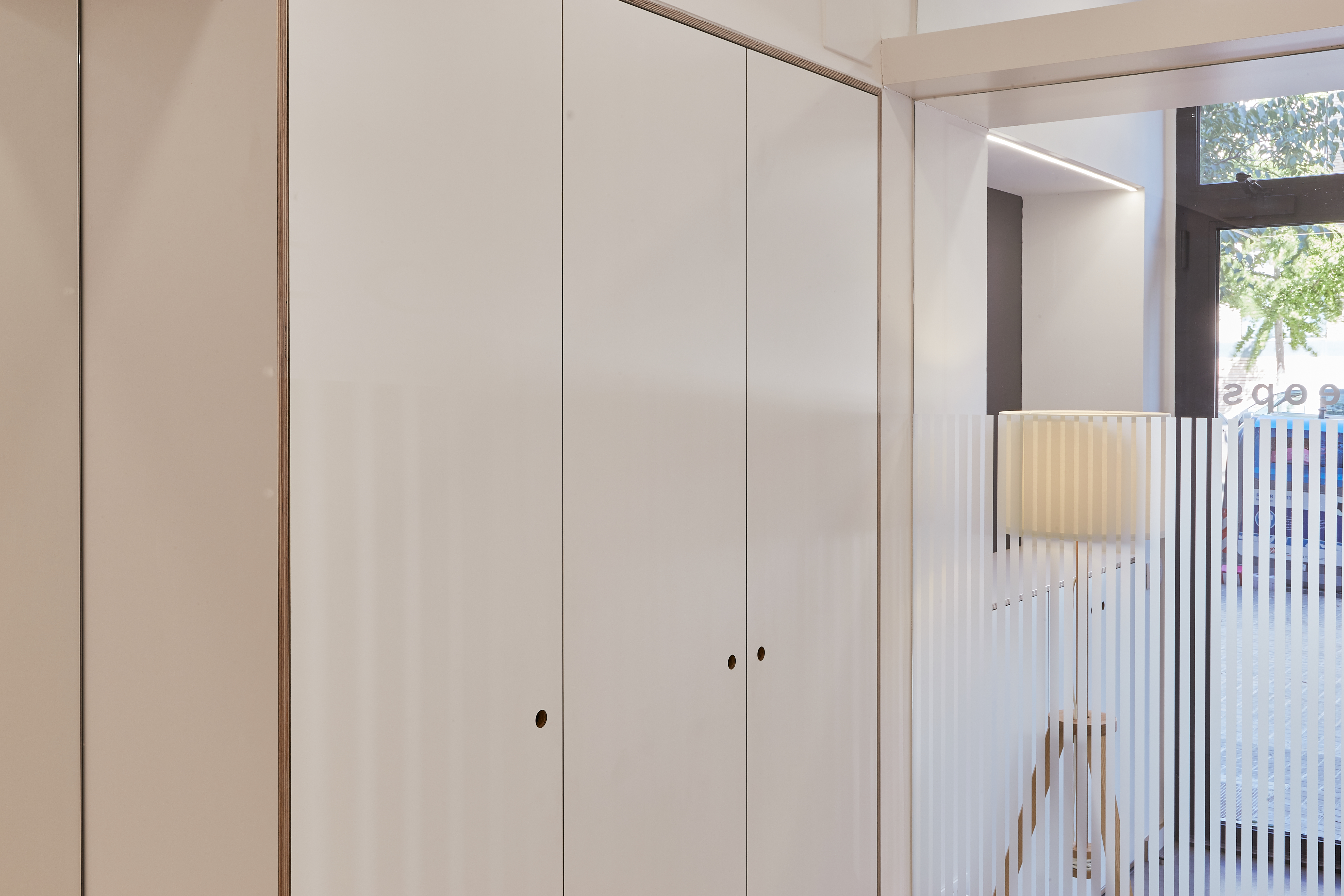
The dividing line between the first strip and the second is intentionally permeable. It’s a pale, flexible layer of skin, translucent enough for us to imagine what’s on the other side. It doesn’t quite reach the ceiling, and it has transparent sections that weave together the spaces and light on either side. This osmosis is regulated by a series of doors, translucid panes of glass, subtle frosted window designs, the interaction between different sources of light and constantly changing reflections.
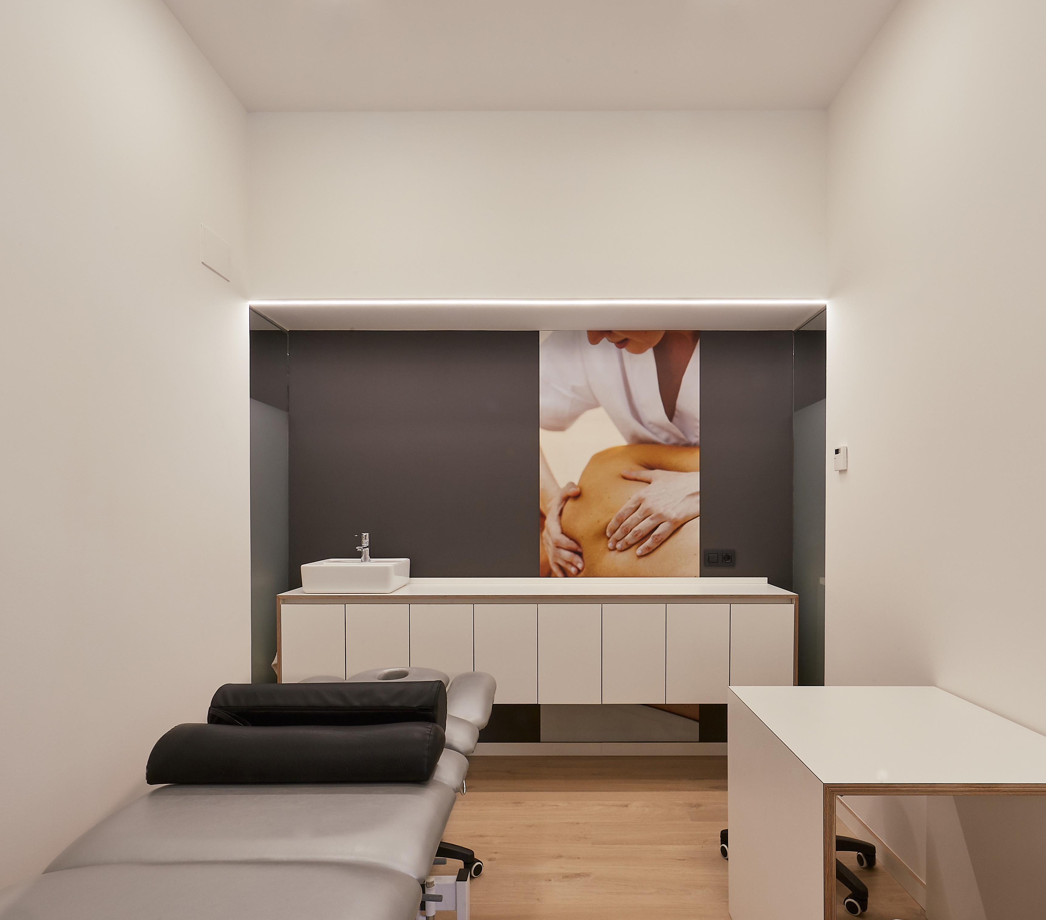
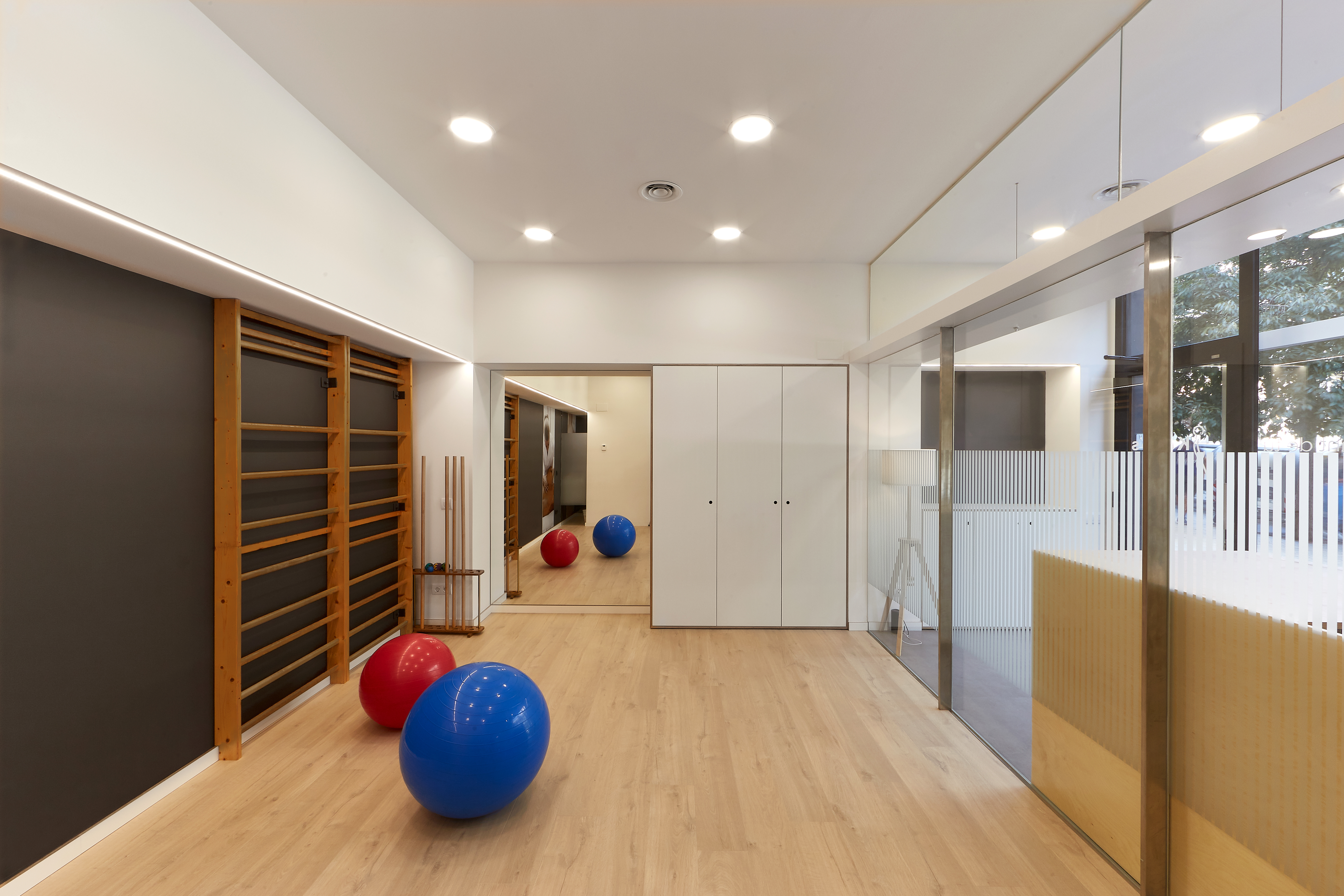
The second strip houses a gymnasium and a rehabilitation space, three booths and a restroom. These spaces can be closed off, blocking out both sound and sight. In a space like this, strict intimacy is a must. Nevertheless, they’re separated by dividing walls that don’t quite reach the back wall, allowing a certain openness to flow through a series of glass dividers that tie together the counters in each booth and the white frames that delineate a black recess against the back wall.
The final strip is merely abstract, made up of images taken inside the physical therapy centre. The view of these images cuts across the other spaces, making them into a massive storefront display of the centre’s purpose, philosophy, professionalism, warmth and high standard of quality.
Each strip uses a different material. The first has a harsh flagstone pavement. The second has a warm wooden floor. The third has a black background and the shared colour scheme of the photographs. The rest is all white. Here, the architecture is clean, neat. It’s practical for the professionals who work here and accessible to the clients who benefit from it.
Category
New construction
Keops Physical Therapy
Keops Physical Therapy